I asked around 15 people which page they thought looked better out of the three on the last post and it is safe to say that I should swap back to the old blue mast head. (Which is good, because I actually preferred that one!)
I will go back to editing with the old mast head and adding the changes mentioned in an earlier post.
Monday, 21 March 2011
Wednesday, 16 March 2011
Back to the old mast head?
I looked at my magazine cover and noticed a few things. The star thing is a little bit too big, as a minor point, so I will need to reduce the size of it slightly.
Also, convention for a lot of magazines that I've seen show that the banner at the bottom are normally sort of in a block together, not separated out like mine. I will need to group those together too.
As a major point, I think that there is now probably too much red. Below is a comparison of my magazine covers, one with the red mast head, and the other with a blue one. There is also an idea that I had about having some of the mast head blue, and the boxes red. All three are below:


Tuesday, 15 March 2011
A new look!
I changed the colour of the star to a blue, which sits well with the redness and stands out well from the rest, which is what that star needs to do in most, if not all magazine covers.
I also tilted the text in the star so it looks more conventional to magazines.
Below is what I have now:

I also tilted the text in the star so it looks more conventional to magazines.
Below is what I have now:

Carrying on with the magazine
I made the changes I suggested on the last post: moving the star and adding a drop shadow.
I also carried forward the point about it not looking like a magazine cover and added a banner to the bottom of the page, along with a bar code:
 I think this looks a lot better. it looks more like a magazine cover now than it first did.
The only thing that immediately springs to mind now is that there is too much red. Everything on the page has some sort of red in it. In terms of colour schemes, from my research I noticed that msot magazine covers have 2-3 colours on them. I have used 2 really, red and white (the blackness doesn't really count as it's a standard colour. The colours of the picture also don't count from what I've seen in my research).
To make the page less plain and to also separate the star from the rest of the page, I will probably change the colour of the star.
I also carried forward the point about it not looking like a magazine cover and added a banner to the bottom of the page, along with a bar code:

The only thing that immediately springs to mind now is that there is too much red. Everything on the page has some sort of red in it. In terms of colour schemes, from my research I noticed that msot magazine covers have 2-3 colours on them. I have used 2 really, red and white (the blackness doesn't really count as it's a standard colour. The colours of the picture also don't count from what I've seen in my research).
To make the page less plain and to also separate the star from the rest of the page, I will probably change the colour of the star.
Back to the magazine
I showed my most recent draft of the magazine cover to my peers and my target audience and I got a few comments about the colour scheme, and that even though the mast head is kind of like a logo (and therefore can be it's own colour and not affect the colour scheme too much), it would probably look better red in this case, instead of blue.
I also got comments like "it doesn't really look like a magazine cover...".
To begin to rectify this, I added a classic 'star' shape in the corner. Here is the result:
 Now in my opinion I think that the star looks a little unprofessional. It definitely needs a drop shadow.
Also, the male actor's head (my head) is almost covered up. So I may need to move the star as well.
I also got comments like "it doesn't really look like a magazine cover...".
To begin to rectify this, I added a classic 'star' shape in the corner. Here is the result:

Also, the male actor's head (my head) is almost covered up. So I may need to move the star as well.
Monday, 7 March 2011
Poster re-visited
Before starting on my magazine cover again, I had a quick look back at my poster with new eyes that haven't seen it in a while.
Immediately I noticed that the 'coming soon' part didn't stand out enough and the production label seemed out of place.
I did a bit of re-jigging and below is another finished draft of my poster:
Immediately I noticed that the 'coming soon' part didn't stand out enough and the production label seemed out of place.
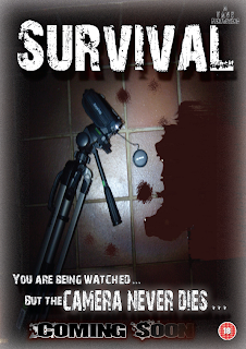
I did a bit of re-jigging and below is another finished draft of my poster:

Having the camera next to the pool of blood directly links in with the trailer itself. At the end of the trailer there is a shot of a pool of blood growing towards the camera lens. This is therefore a picture of that last shot from above. This would then link the two products together and with those along with the magazine, would create a lovely promotional package for the film.
Magazine cover
After showing people my magazine cover that has now been changed to red, I was told that it didn't really look like a magazine cover.
I looked at it for a while and looked at some issues of Empire magazine that I had and decided I need to fill some of the space I have on the page.
I will go away and do some more work on this filling the spaces with more film-y stuff.
I looked at it for a while and looked at some issues of Empire magazine that I had and decided I need to fill some of the space I have on the page.
I will go away and do some more work on this filling the spaces with more film-y stuff.
Friday, 4 March 2011
Completed video
After changing all the things I agreed with from my class, I exported my teaser trailer and uploaded it to youtube. Below is the video:\
A feedback session
My whole media class, who are all just 18 and therefore predominantly my target audience, had a feedback session. They all sat and watched my teaser trailer and then gave me some feedback on what they liked and their comments on it.
Below is a video of the feedback I got from them and comments below it of my opinion on them, whether I will carry out the change they suggested and what I agree/disagree with.
I will analyse the points in the order that they are said:
The first comment was that they would actually want to see the full film if I was making it, which is really good news. It means my teaser trailer was successful.
I was also told the cutting was good, but there was a lot of black. I knew what he meant by this so I will go away and shorten all the parts where there are no images. However one comment was that in the shot where the girl is dragged down the corridor, you can still see her foot at the end. I will have to cut it a bit sooner while she is still being dragged so it doesn't stand out as much.
They seemed to be confused about what the shot was where the white and red thing hits the camera. As I explained, this was my brother in a blood stained shirt. I didn't mind this though, despite what they thought it was, because I wanted my teaser trailer to be one of those ones that you have to see more than once to really get what it all means. This is the same with the shot of the couple kissing with the strange character again with a blood stained shirt in the background. We did watch my trailer more than once and on the second or third time people were actually saying "oh I never noticed that before!", which is exactly what I wanted with my teaser trailer. It gets people enticed and wanting to see it.
This point is then sort of carried forward with "it makes me wonder what the film will be about".
The next part is quite interesting. Louis states that he thinks he's at a loss. Although he enjoyed the teaser trailer and he knows it will scare him, he seemed to think that he may not have seen enough to want to see the film. However Liz then carries on saying that it is just the teaser trailer and not the full trailer, so there would be more footage to come. People seemed to agree with this and again goes to show that my teaser trailer was successful.
Wednesday, 2 March 2011
Look, It's red!
As the title suggests, I re-did the page in red. Here it is:
 I do think this is starting to look a lot better.
I do still think there is work to do though, so I will keep fiddling with the page and see what I can do with my creativity chromosome!
The one thing that I mustn't do now is add any more colours. Many, if not all professional magazines of all types of media generally only stick to about three colours as a maximum. normally two.
I have the purple and blue from the mast head and the gotham logo at the bottom, the red of the anchorage text and black of the normal text. So I don't have room for any more colours.
Second draft!
So, here it is. The second completed draft. There are a few things to improve on, which I shall explain shortly.
 Firstly, the 'Survival' anchorage text doesn't stand out enough for me. So I will need to make that bigger somehow, which will involve moving the 'plus' section somewhere else.
Another big problem is that the piece of text to go with the 'survival' part is too much. It shouldn't be a paragraph. I will need to shorten that.
Finally, the colour scheme is a bit off. I sampled the purpleish colour from the 'Reel Time' logo and used that in some of the other words and as the glow colour for the 'Gotham independant film awards' logo at the bottom. However, purple doesn't match horror at all really, so I needed a different colour.
I watched my teaser trailer again at this point to see if there were any certain colours that stood out. At the end where the title appears, it sort of fuzzes into a red.
For this reason, I decided to go with red instead of purple.
The next post will be the same page but with all the problems listed above hopefully corrected.
New picture
Here is a second draft with a different picture:
 I do think this picture is better. I used the 'dark strokes' effect on photoshop and it seemed to turn our eyes completely black.
Normally this wouldn't look good but due to the genre and narrative of my teaser trailer I think this is quite fitting. Conventions of real film magazines show that the actors on the front normally have something on them, whether it being a costume or a prop of just the way they look, that links them to the film.
This is quite obvious actually because if there was someone featured on the front cover who was wearing normal clothes and there was no text linking them to anything, the reader may not realise they are anything to do with.... well, anything! Let alone being in a film.
So yeah, I'm going to carry on using this picture and the next post will be the same picture but with the rest of the text added in.
Subscribe to:
Comments (Atom)